Example
This example will show you how to make a plot with data, a number of stacked MC components, a representative signal, and a ratio plot.
First, we just load some packages.
import numpy as np
import matplotlib.pyplot as plt
import scipy.stats.distributions as dist
import boost_histogram as bh
Make Histograms
We need some histograms to plot, so let’s generate some. We’re making Boost histograms here but you can also read a TH1 from a ROOT file with Uproot and convert it. We can deal with anything that follows the UHI PlottableHistogram protocol.
rng = np.random.default_rng()
bkg1_dist = dist.expon(0, 3)
bkg2_dist = dist.expon(1, 3)
part1_dist = dist.norm(2, 0.2)
part2_dist = dist.norm(3, 0.4)

bkg1_data = 100*bkg1_dist.rvs(20000, rng)
bkg2_data = 100*bkg2_dist.rvs(5000, rng)
part1_data = 100*part1_dist.rvs(1500, rng)
part2_data = 100*part2_dist.rvs(500, rng)

x_axis = bh.axis.Regular(30, 0, 1000)
bkg1_h = bh.Histogram(x_axis).fill(bkg1_data)
bkg2_h = bh.Histogram(x_axis).fill(bkg2_data)
part1_h = bh.Histogram(x_axis).fill(part1_data)
part2_h = bh.Histogram(x_axis).fill(part2_data)

data_h = (bh.Histogram(x_axis)
            .fill(100*bkg1_dist.rvs(20000, rng))
            .fill(100*bkg2_dist.rvs(5000, rng))
            .fill(100*part1_dist.rvs(1500, rng))
            .fill(100*part2_dist.rvs(500, rng)))
Make Plot
We start by loading ATLAS MPL Style, and activating the configuration.
import atlas_mpl_style as ampl
ampl.use_atlas_style()
First we setup the axes. ratio_axes() splits the figure into a large
main area, and a smaller area below for the ratio plot. The two will
have no space between them vertically, and share the x-axis.
fig, ax, rax = ampl.ratio_axes()
ax.set_xlim(0, 1000)
ax.set_ylim(0, 4000);
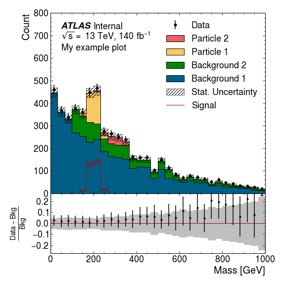
First we plot the MC histograms. There’s a slight misnomer here, and all the stacked histograms are called “Backgrounds”, but they need not necessarily be backgrounds.
The return value is used to make the ratio plot. Note that unlike the
other plotting functions this one is only in ampl.plot. Nevertheless
it can still take UHI histograms.
bkg = ampl.plot.plot_backgrounds([
    ampl.plot.Background(label="Background 1", hist=bkg1_h),
    ampl.plot.Background(label="Background 2", hist=bkg2_h),
    ampl.plot.Background(label="Particle 1", hist=part1_h),
    ampl.plot.Background(label="Particle 2", hist=part2_h),
], ax=ax)
Next we plot the data, and a “signal”. This plot_signal function is
used to plot a representative signal that is layered on top of the other
histograms (rather than being stacked), and is drawn unfilled. You might
want to boost the strength of this signal to ensure it is visible.
If you are plotting a signal component whose strength relative to the other MC components is accurate (e.g. the signal component of a fit) you should include that in the stack of “Background”s.
ampl.uhi.plot_data(hist=data_h, label="Data 18", ax=ax)
ampl.uhi.plot_signal(label="Signal", hist=part1_h, color="paper:red")
ampl.uhi.plot_ratio(data_h, bkg, ratio_ax=rax, plottype='diff')
Now we set the x and y labels. Note that the set_xlabel function can
be given the main axes, and the label will still be drawn below the
ratio axes.
ampl.set_xlabel("Mass [GeV]", ax=ax)
ampl.set_ylabel("Count", ax=ax)

# This one uses the axis set_ylabel because we want it centre aligned
rax.set_ylabel(r"$\frac{{Data} - {Bkg}}{{Bkg}}$");
Finally we draw the ATLAS label and the legend. So long as the
components of the plot have been drawn using the ATLAS MPL style
functions the order of items in the legend will be determined
automatically if you use the ampl.draw_legend function.
Notice that because the signal has statistical error bands the
“Stat. Uncertainty” entry has also been added to the legend.
ampl.draw_atlas_label(0.05, 0.95, ax=ax, status='int', simulation=False, energy='13 TeV', lumi=140, desc="My example plot")
ampl.draw_legend(ax=ax); # Using one column here. If you have space, you can use ncols=2 for two columns
And save the figure, ensuring everything is visible.
fig.tight_layout()
plt.savefig('test.png', dpi=150)
Output